
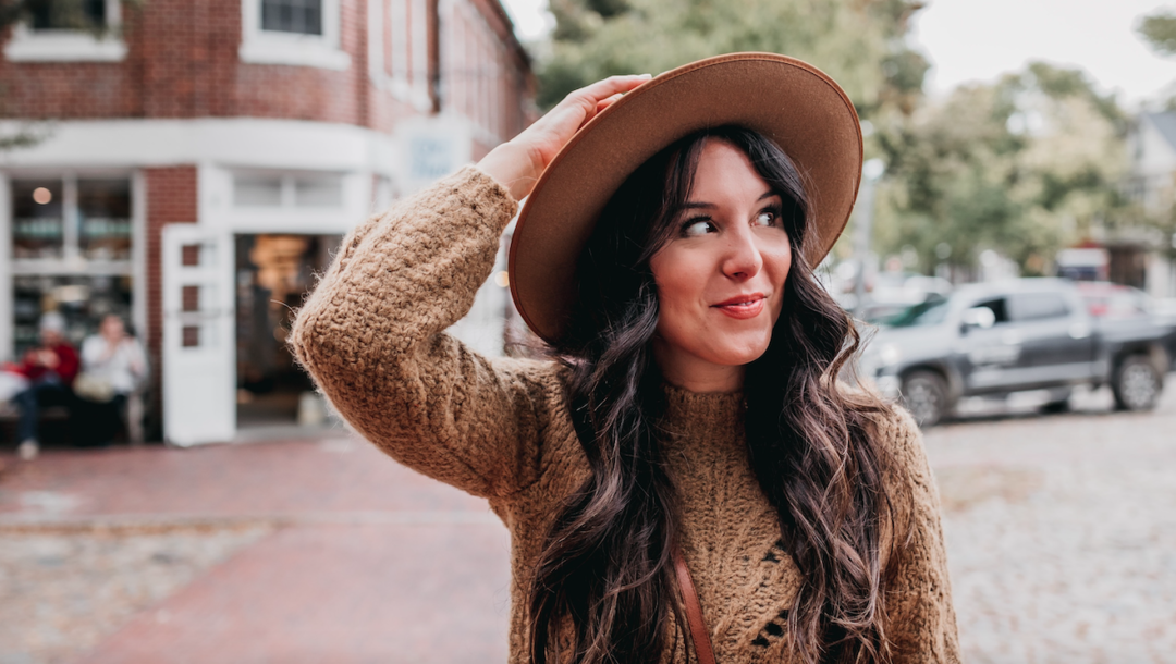
I love photography and I absolutely love making presets! It’s such a fun creative outlet to be able to create the exact look and feel you want for a photo. These Six Lightroom Mobile Presets are the result of an entire years worth of playing, creating, and tweaking. After receiving many inquires about how I edit my Instagram photos, I wanted to offer the styles I love and make them accessible to everyone!
Weather you’re editing an iPhone photo or a high-res raw photo from your DSLR camera, these edits are designed to flatter & enhance the look of your original. Use these six presets to edit your photos in the Lightroom Mobile App, which can be downloaded for free in the AppStore.
What You Get with Your Purchase:
1. Six lightroom mobile presets
2. An easy-to-follow visual guide for how to install them
About the Presets
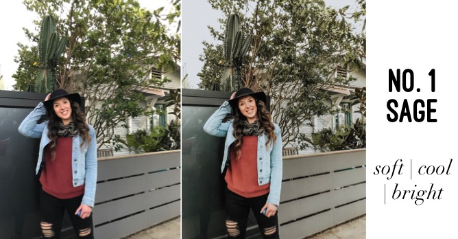
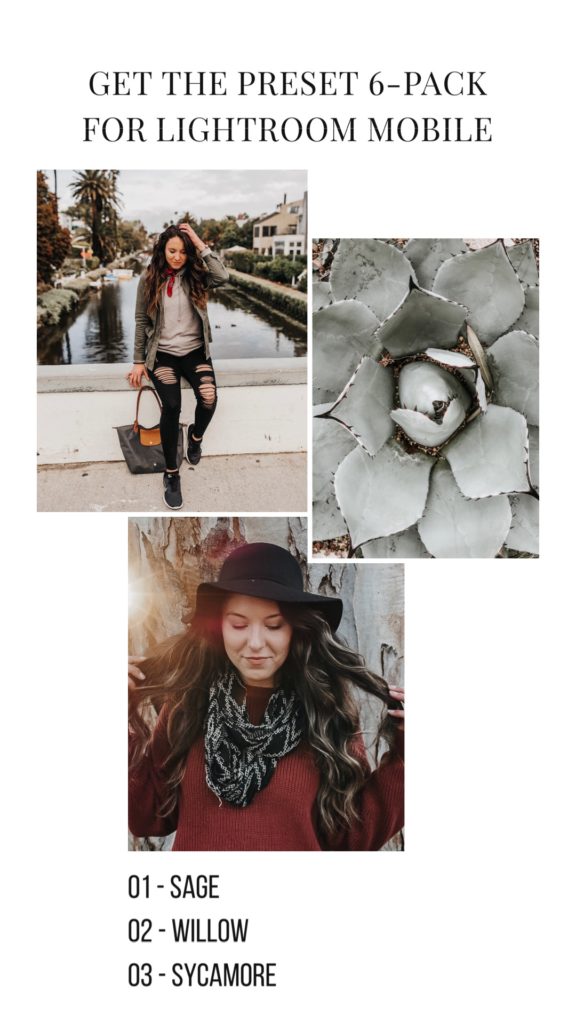
1. Sage is super versatile and looks good on almost any photo. It has soft cool greens & blues while adding brightness and clarity. It’s flattering on skin tones (great for avoiding the oompa-loompa orange skin look).
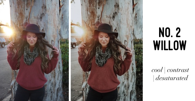
2. Willow is one of my personal favorites. It’s crisp, boosts contrast, and desaturates. Cool undertones gain a little highlight while warm tones soften. It’s great for avoiding orange-y skin tones and works well for a variety of lighting situations.
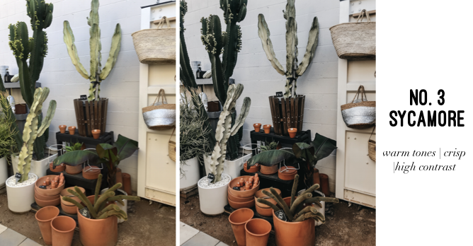
3. Sycamore is warm, high-contrast, and crisp. With slightly muted greens, warm undertones, and crisp lines. This edit looks great for images with a white/gray background.
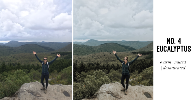
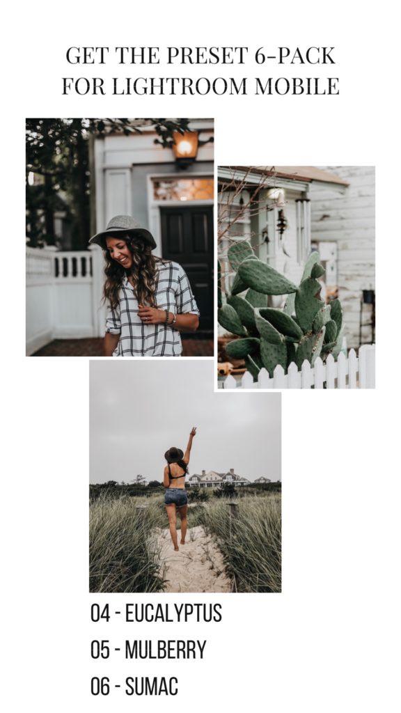
4. Eucalyptus is my go-to for any photo with lots of greenery. It offers a beautiful combo of warm and cool tones: warm tones brighten, while cool tones get desaturate and gain warmth. I’ve found it very flattering on a variety of landscapes.
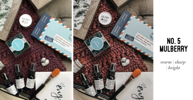
5. Mulberry was designed with flatlay photos in mind. This preset helps un-muddy those flat shadows and makes things pop. It’s great for someone wanting to create a warm, bright, crisp image.
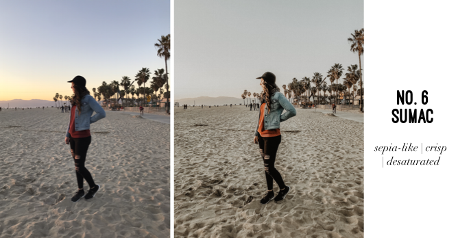
6. Sumac is sepia-like without losing the crisp suble coolness of whites/highlights. It offers warmth to greens while desaturating them. This preset offers variety, as it offers such a different look from one photo to the next.
Who These Presets Are Perfect For:
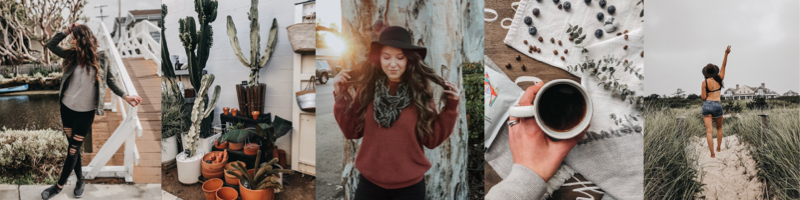
These presets are perfect for anyone looking to create a more streamlined cohesive look to their IG feed: casual Instagrammers, influencers, lifestyle bloggers, and small business owners. I also designed most of them with skin tones in mind (because no one wants to look like an oompa-loompa).
Use these edits for your lifestyle, wonderlust, selfie, flatlay, cozy interior photos and more.
Suggestions for Editing:
Ideally every photo would have great lighting: not too bright/washed out, and not too dark/shadowy. For the best results with almost any photo the work starts with your lighting. You can’t out-edit bad lighting.
Additionally, I designed the presets to be complimentary to most skin tones (because no one wants to look like an oompa-loompa). That being said, please keep in mind that each individual photo may need to be slightly adjusted based on it’s individual exposure, colors, contrast, and lighting. It’s also helpful to know that presets are ideal when your image has a balanced exposure (not too light, not too dark). Overall however, presets are phenomenal for saving time and allowing you to achieve a desired look with very minimal effort.
Tips For Great Lighting:
I think the best advice I ever received as far as lighting goes was to always avoid shooting people in direct sunlight. Basically you don’t want to put your subjects in the position where they are staring into the sun & having to squint. Additionally, direct sunlight, or really any time when the sun is at its’ peak (think between 11:00 – 2:00 PM), tends to create weird & unflattering shadows.
Instead aim to shoot anytime when the sun in lower in the sky (think closer to sunrise and sunset). This is really when you can “play” with light. You’ve probably heard of “Golden Hour” which is referring to the window of time just after sunrise and just before sunset. This is when indirect sunlight becomes your best friend because it creates softer, warmer, more diffused light. Additionally shooting in the shade or on an overcast cloudy day works too. These situations are typically very flattering and create a nice evenly diffused light, which is especially great for shooting people/ lifestyle photos.
My Typical Adjustments To Lightroom Mobile Presets:
EXPOSURE:
I’ll drop this down if the photo is a bit overexposed/washed out OR increase the exposure if the photo is inherently darker
SHADOWS:
Increasing the intensity of your shadows can bring a crispness to the photo that inadvertently intensifies the contrast
CONTRAST & BLACKS:
Similarly to shadows, these tools when increased help to add distinction to your photo
DEHAZE:
In Lightroom Mobile this option can be found under “Effects”. It’s another tool I use to tweak the exposure/contrast look – just in a slightly different way. I suggest playing with it until you find your desired look.
COLORS:
I personally keep the colors pretty consistent when using a preset. Sometimes I will adjust the saturation of the orange color in particular to adjust for skin-tone.
No Comments